
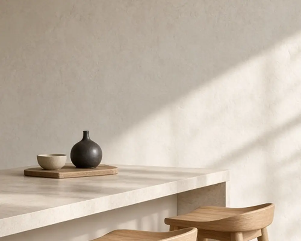
10 Warm Neutral Kitchens in Cashmere and Stone

On this page12 sections
For years, the default neutral kitchen was cool: bright white cabinets, gray counters, chrome. The look that has replaced it is warmer and softer. Think of the color of a cashmere sweater, a pale stone wall in afternoon sun, or unbleached linen. These are warm neutrals: beige, greige, mushroom, oatmeal, and putty, often layered together in one room.
A cashmere kitchen feels calm and grown up. It is also forgiving of changing trends, because it sits close to the colors of natural materials that never go out of style. It hides everyday wear better than pure white, flatters natural materials like wood and stone, and looks good in both bright and dim light. The ten ideas below show how to build one, from choosing the right cabinet shade to layering stone, wood, and texture so the room does not feel flat. For calm wall colors that suit these kitchens, the quiet wall colors post is a useful companion.
As an Amazon Associate I earn from qualifying purchases.
What makes a neutral warm
Every neutral has an undertone. Warm neutrals lean slightly yellow, pink, or red; cool ones lean blue or green. In a kitchen, the difference shows most at night under artificial light and next to other materials.
To check, hold a paint swatch next to a sheet of pure white printer paper. A warm neutral will look slightly creamy, peachy, or golden beside it. A cool one will look bluish or greenish. For a cashmere kitchen, choose the creamy ones. Check them again at night, under your own bulbs.
Also look at depth. The softest look uses shades that are close together: a light greige wall, slightly deeper greige cabinets, and a stone counter in between. Strong contrast between light and dark breaks the calm.
A useful approach is to pick one paint family and use three steps of it: the lightest for walls and ceiling, a middle step for cabinets, and the deepest for an island or a few accents. Many paint brands print related shades on the same strip, which makes this easy. The result is a room that feels harmonious from every angle.
Floors matter too. Warm oak, terracotta, limestone, or a warm-toned tile all suit a cashmere palette. A cool gray floor can work, but bring in a warm rug to balance it.
1. Warm greige cabinets
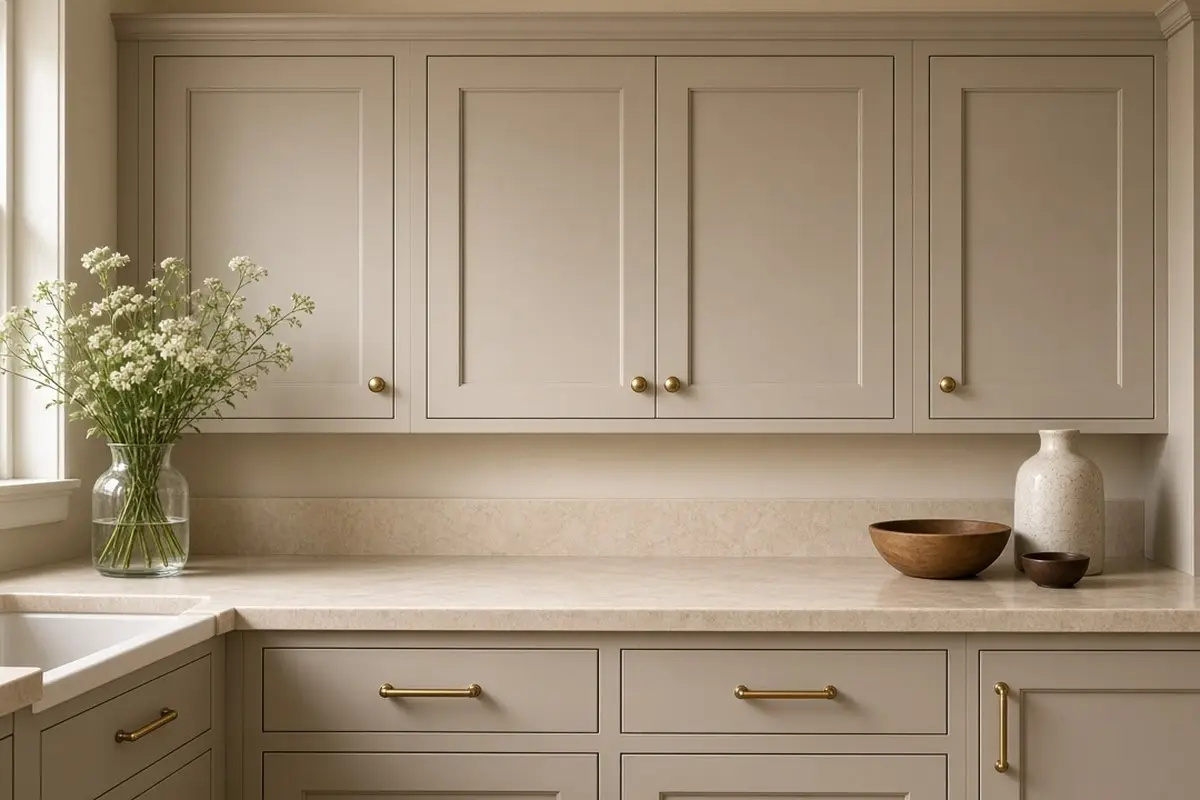
Greige, a blend of gray and beige, is the backbone of a warm neutral kitchen. On cabinets, a mid-light greige with a warm undertone looks soft and expensive and hides fingerprints and scuffs far better than white.
Paint a sample door and look at it next to your counter and floor. In north light, choose a slightly warmer greige; in strong south light, a slightly cooler one stays calm.
Greige suits nearly every cabinet style. On Shaker doors it looks classic, on flat slab doors it looks modern and Italian, and on beadboard or inset cabinets it looks like an old country kitchen. Because it sits between warm and cool, it also works with most existing floors and counters, which makes it a safe choice for a refresh.
Use a satin finish for durability. Greige in satin has a soft glow that flatters the color without looking shiny.
Get the look
2. Beige kitchen cabinets, updated
Beige cabinets were once considered dated, but the new beige is softer and more muted: closer to sand, oat, or mushroom than to the yellowish beige of the 1990s. Paired with natural stone and matte hardware, it looks fresh.
Avoid beige with a strong yellow or pink cast. A slightly gray or earthy beige is easier to live with.
The secret to modern beige is what surrounds it. Old beige kitchens paired beige with honey oak and busy granite. New beige kitchens pair it with pale or dark wood, simple stone, and lots of texture. Change the company and beige looks completely different.
Get the look
3. A warm gray kitchen
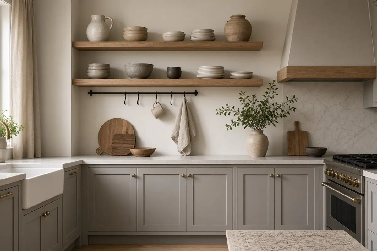
If you prefer gray, choose a warm gray with a hint of brown. It reads as a soft neutral instead of the cold gray of the last decade. Pair with cream walls and warm wood.
Warm gray works well in kitchens with existing gray floors or counters that you want to keep. It bridges the cool surfaces and the new warmer palette. Add cream textiles, a jute rug, and brass accents to push the room further toward warm.
Get the look
4. Honed stone counters
Polished counters can feel cold and shiny. They reflect every light fixture and show water spots, which fights the soft, quiet mood a warm neutral kitchen is aiming for. Honed or leathered stone, or quartz with a matte finish, has a soft, chalky surface that suits a warm neutral palette. Look for cream, warm white, or pale taupe with gentle veining.
Honed stone shows fewer scratches and smudges than polished stone, but it can show oil marks more readily, so seal it well and wipe spills promptly. Quartz with a matte or suede finish gives the same look with less care. Laminates now come in convincing matte stone looks too, which suits a budget refresh.
Get the look
5. Limewash or plaster walls
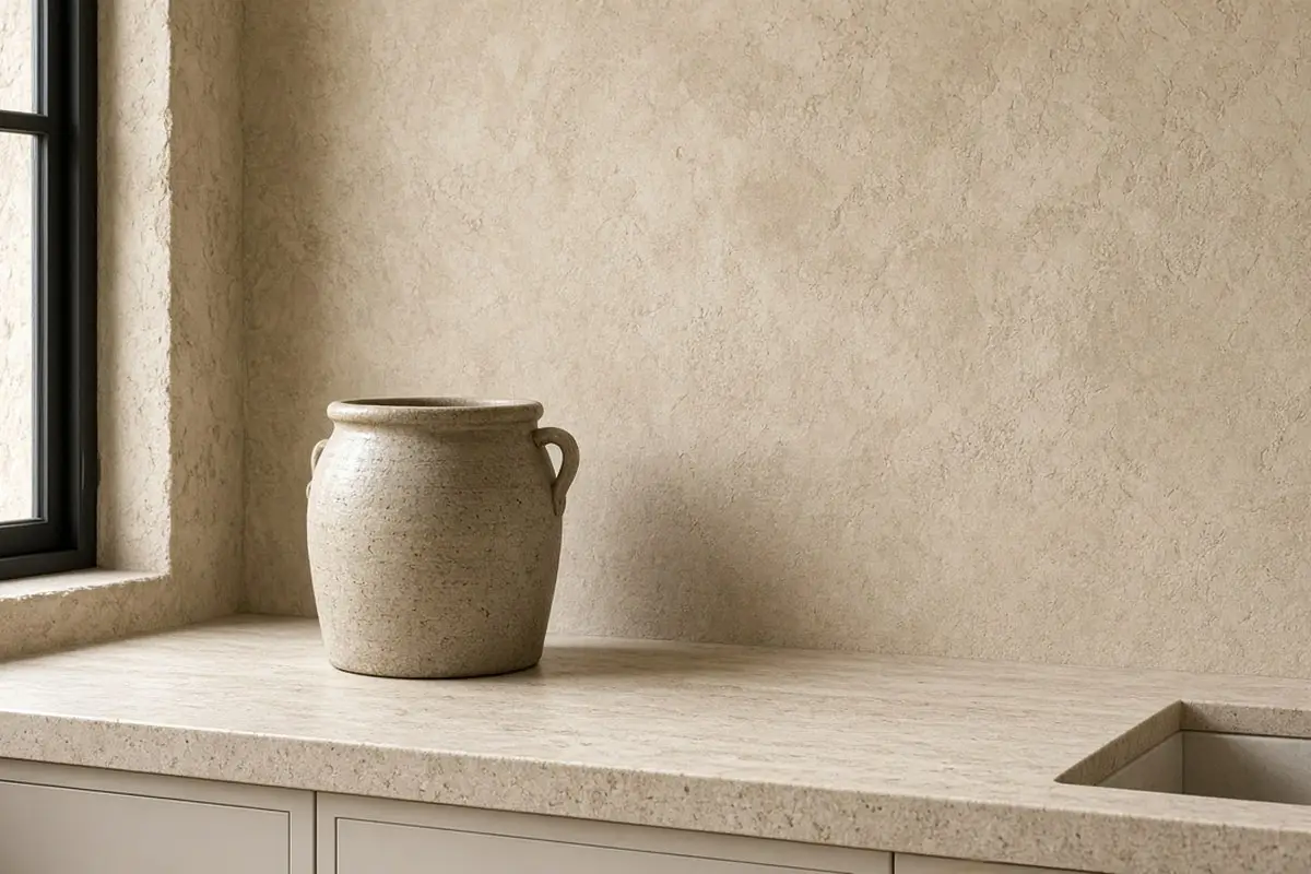
A limewashed or plaster-effect wall in a warm stone shade adds movement and depth that flat paint cannot. It suits a cashmere kitchen perfectly.
Limewash is breathable and natural, and the soft, cloudy finish catches light differently through the day. It works best on walls away from direct splashes. Behind the stove or sink, use tile or a sealed finish instead.
If limewash feels like too much, a flat matte paint in a warm stone shade still softens the walls, though without the movement.
6. Natural oak and walnut
Warm wood is essential in a neutral kitchen. Oak stools, a walnut cutting board, or open oak shelves add warmth and keep the palette from going flat.
Mix wood tones carefully. Pale oak and walnut look good together because they contrast clearly. Woods that are nearly but not quite the same can look like a mismatch. Repeat each wood at least twice so it feels planned.
Get the look
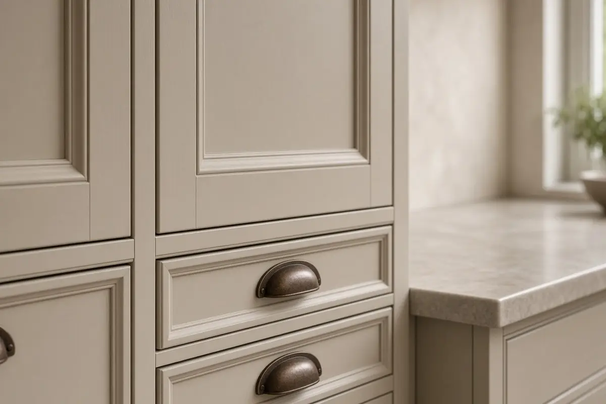
7. Matte hardware
Brushed brass, aged bronze, or matte black hardware suits warm neutrals. Brass adds a glow, bronze adds depth, and black adds crisp definition. Pick one to lead. Avoid shiny chrome, which can look cold.
If your faucet is chrome and you do not want to replace it, choose hardware in brushed nickel, which bridges chrome and warmer finishes. Otherwise, a brushed brass or matte black faucet completes the look.
Get the look
8. Layered textures
In a single-color palette, texture does the work. Think of how a cream knit sweater, a linen shirt, and suede shoes look together: same color family, completely different surfaces. Linen, rattan, stoneware, wood, and stone together create depth.
Without texture, a neutral kitchen can look bland or unfinished. With it, the same colors look rich and layered. Add one or two pieces in each material: a linen curtain, a rattan basket, a stoneware crock, a wood board, and a stone tray. Look for handmade or imperfect pieces, which add character.
Get the look

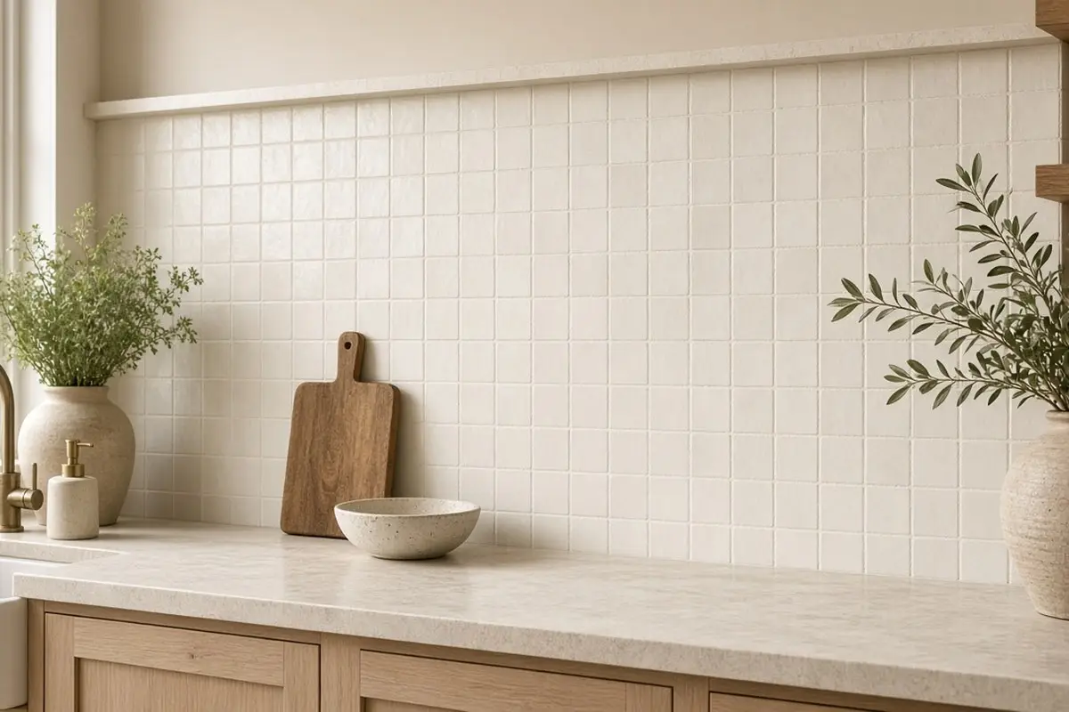
9. A tone-on-tone backsplash
A backsplash in cream zellige or a warm white handmade tile adds subtle shimmer without breaking the palette.
Handmade-look tile has slight variations in color and surface, which catch light and add interest even in a single color. Use a warm grout, such as almond or a soft beige, rather than bright white or gray, so the backsplash reads as one soft surface.
10. Warm lighting
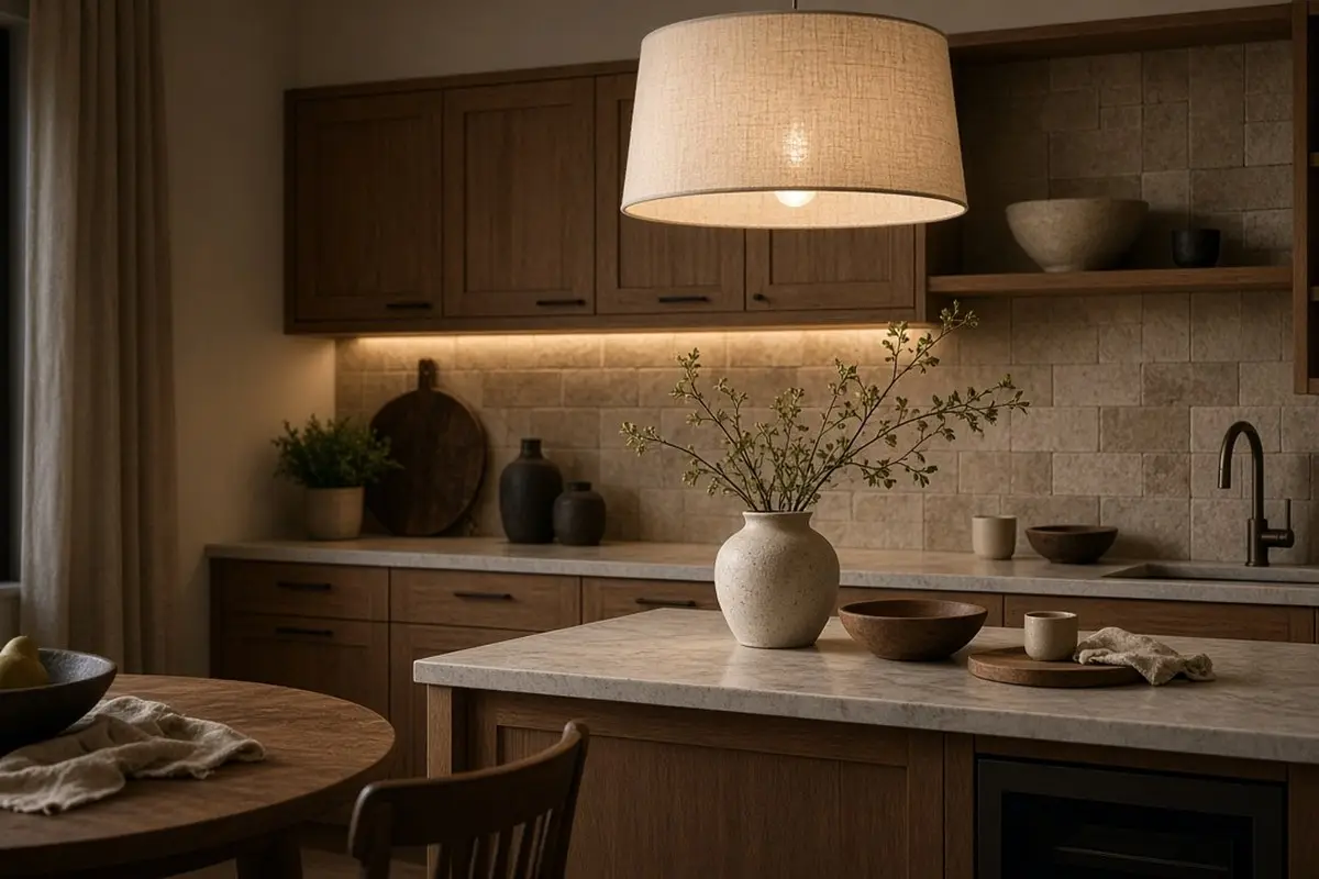
Warm bulbs, around 2700K, make cashmere neutrals glow. Check every fixture, including the range hood and the inside of glass cabinets, since one cool bulb stands out. Cool bulbs turn them gray.
Layer the lighting: under-cabinet strips for work, pendants over the island or table, and a small lamp on the counter for evenings. A lamp in a kitchen sounds unusual, but it makes a warm neutral kitchen glow at night and feel like part of the living space.
Get the look
FAQ
What is a cashmere kitchen?
A kitchen in soft, warm neutrals like greige, oatmeal, and stone.
What color cabinets go with warm neutrals?
Greige, soft beige, mushroom, or warm gray.
Is beige coming back for kitchens?
Yes, in softer, earthier versions. The kitchen color schemes post covers matching to your counter.
How do I keep a neutral kitchen from looking boring?
Layer texture and natural materials, use warm wood, and add plants and handmade pieces. A few darker accents, like black hardware or a walnut board, add definition.
Can a small kitchen use warm neutrals?
Yes. Light warm neutrals make a small kitchen feel bright and calm, and close shades blur edges so the room feels larger. The very small kitchen layout post has more small-kitchen tips.
Should the island be a different color?
It can be a deeper shade from the same family, such as mushroom or taupe, or warm wood. Keep it in the palette so the room stays calm.
What accent colors suit a cashmere kitchen?
Soft sage, olive, terracotta, rust, and muted blue all work in small doses, such as tea towels, a rug, or a pot of herbs on the sill.
A cashmere kitchen is calm, warm, and forgiving. Keep the shades close, layer texture, and light it warmly.