
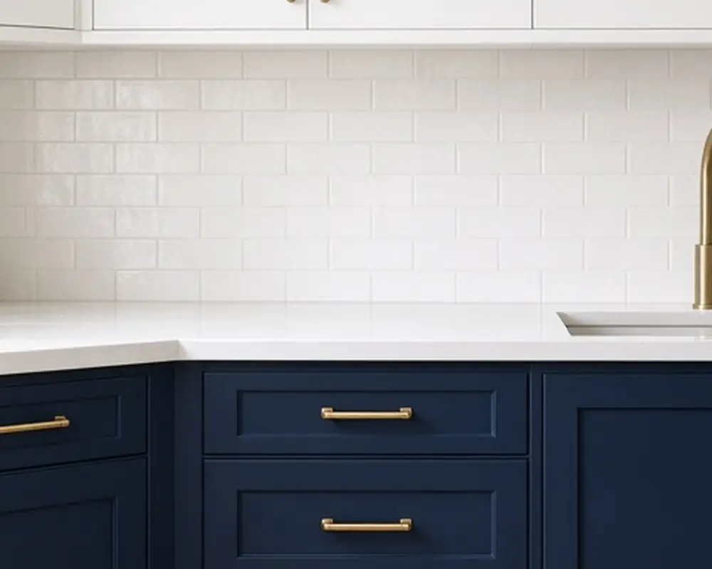
10 Two-Tone Kitchens Where the Dark Half Is the Base

On this page11 sections
A two-tone kitchen splits the cabinets into two colors, and the most reliable way to do it is dark on the bottom, light on top. It follows a simple design logic: darker colors feel heavier and belong lower down, like a floor, while lighter colors feel airy and belong higher up, like a ceiling. The result is a kitchen that feels grounded and open at the same time.
Dark lower cabinets are also practical. They hide kicks, scuffs, and splashes from busy feet and pets, while light uppers keep the room bright and stop it from closing in. The ten ideas below cover the best color pairings, how to balance them, and a few details that make two tone cabinets look deliberate rather than undecided. If you are choosing colors around an existing counter, the kitchen color schemes post has a step-by-step method.
As an Amazon Associate I earn from qualifying purchases.
1. Navy and white
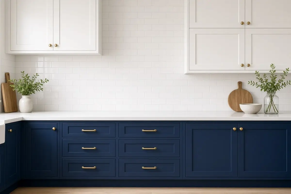
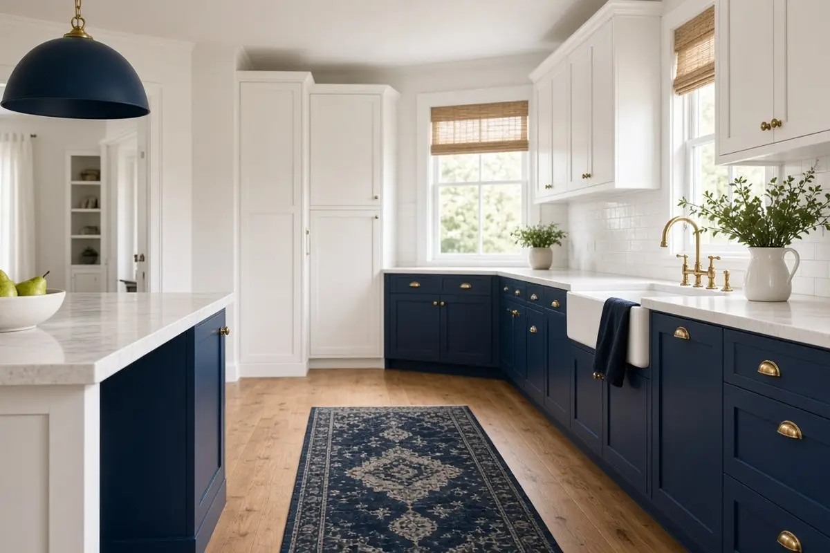
The classic. Deep navy lowers with crisp white uppers look fresh, a little nautical, and timeless. Navy is dark enough to ground the room but softer than black, and it works with both brass and nickel hardware. It also suits almost any floor, from warm oak to gray tile, which makes it an easy first step into color.
Pair with a white or light marble-look counter so the line between the two colors is clean. Light flooring also helps, especially in a small room, by keeping the dark base from merging into the floor below it. The counter acts as a crisp horizontal band, almost like a belt line, that separates the two colors. A white subway tile backsplash keeps the upper half light. Brushed brass pulls warm up the navy; polished nickel makes it look crisper.
Choose a navy with a hint of gray if your kitchen is small or gets little daylight. Very saturated navy can read almost black in dim rooms.
Painting the lower cabinets yourself is a weekend project. Remove doors and drawer fronts, label them, and clean every surface with a degreaser. Sand lightly, prime with a bonding primer, and finish with two thin coats of a durable cabinet paint. Let it cure for a few days before reattaching hardware and loading drawers. A small foam roller gives the smoothest finish on flat doors.
Get the look
2. Forest green and cream
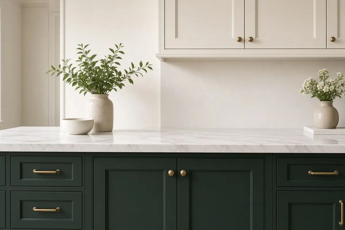
Deep green lowers with creamy uppers feel warm and slightly traditional, a little like an English country kitchen. Green is one of the most popular kitchen cabinet colors right now, and it works with wood floors, brass, and natural stone.
Use cream rather than stark white on the uppers. Bright white looks harsh next to warm green; cream softens the contrast. Unlacquered brass hardware completes the look.
Green lowers look particularly good with a wood floor and a few plants on the counter or windowsill. The green in the cabinets connects to the living green of the plants, and the whole kitchen feels warmer. Choose a green with some gray or black in it for the most sophisticated result; bright, clear greens date faster.
If you are nervous about committing, try sage or olive first. They are lighter and softer but still give clear contrast with cream uppers.
Get the look
3. Charcoal and light gray
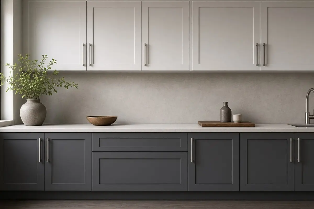
For a soft, modern look, try charcoal lowers with very pale gray uppers. The contrast is gentler than black and white, and the kitchen feels calm. Matte black or stainless hardware suits it.
This pairing works well with concrete-look or white quartz counters and a simple tile backsplash.
Charcoal and light gray suit kitchens with cool light, such as north-facing rooms, because the gray palette agrees with the light rather than fighting it. Add warmth through wood, a warm white bulb, and textiles so the room does not feel cold in winter.
Get the look
4. Black and white
Black lowers with white uppers is graphic and strong. It suits modern and industrial kitchens. It also suits old houses with simple Shaker doors. To keep it from feeling stark, add warm wood in the floor, open shelves, or stools.
Black shows dust and fingerprints, so choose a matte or satin finish and wipe it often.
Black and white kitchens benefit from a third material. Warm wood is the easiest, but brass, leather stools, or a patterned tile floor also soften the contrast. Without a third element, the kitchen can look like a showroom.
Get the look
5. Wood lowers with painted uppers
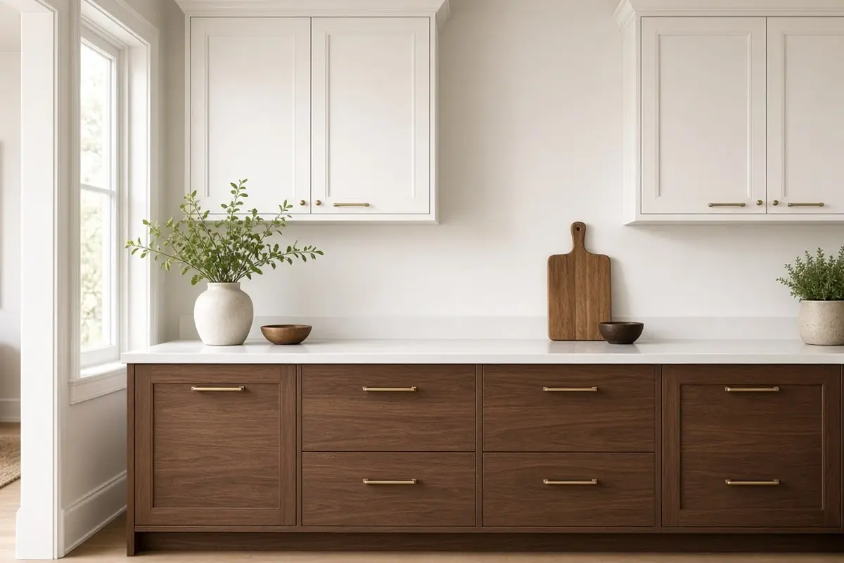
A wood-toned base with painted uppers mixes warmth and brightness. Walnut, oak, or a rich stain on the lowers grounds the room, and white or soft green uppers keep it fresh.
This is also a smart choice if you already have wood cabinets you like the lower half of. Keep the lower cabinets as they are and paint only the uppers. It modernizes an older wood kitchen at a fraction of the cost of new cabinets, and it is easy to undo later.
6. A dark island, light perimeter
A variation on the theme: keep all perimeter cabinets light and paint only the island dark. The island becomes the anchor in the middle of the room.
This approach is good for kitchens where the perimeter is small or broken up by windows and doors. The island is the one big piece of cabinetry you can paint boldly. Choose stools in a material that suits both the island and the perimeter, such as natural wood or leather.
If the island has seating, the dark color also hides scuffs from shoes, which is a real benefit.
Get the look
7. Open shelves instead of uppers
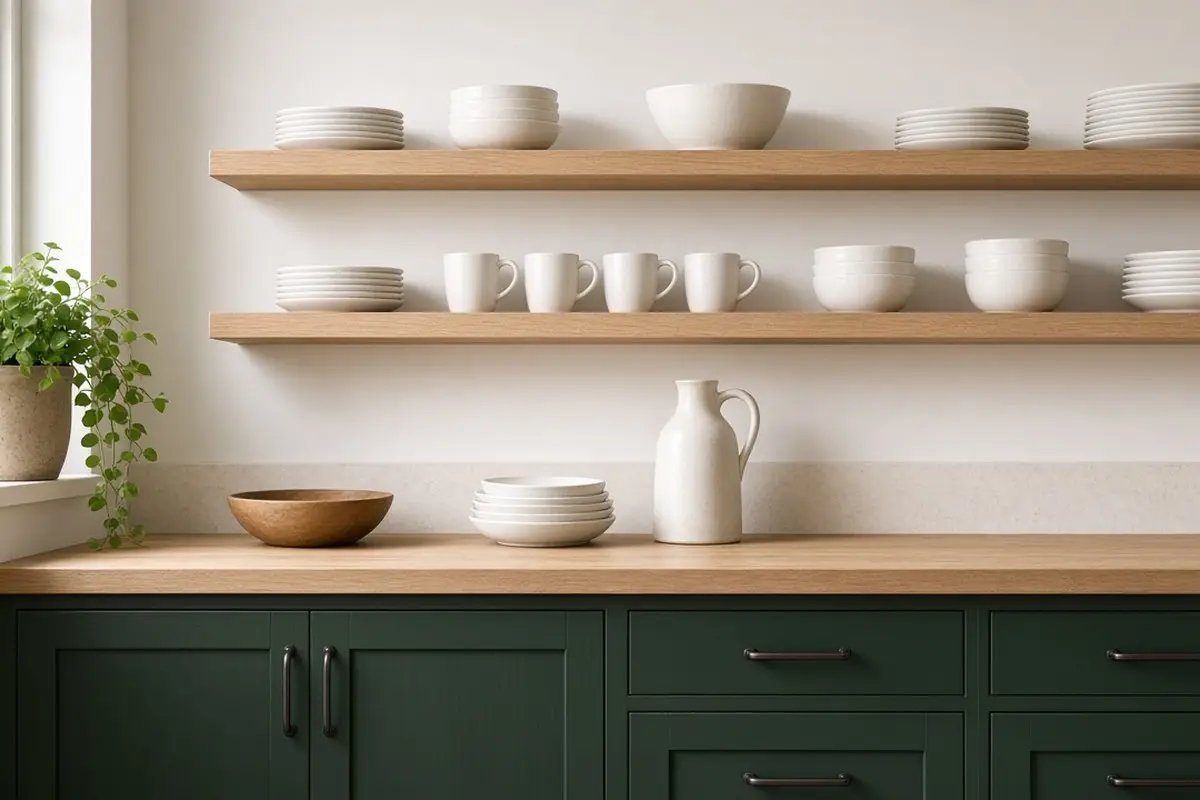
Replace some uppers with open shelves in a light wood or the same color as the wall. The dark lowers stand out even more.
Open shelves keep a small kitchen feeling spacious and give you a place to show off nice dishes or cookbooks. Keep them simple: white plates, a few glasses, a plant. A cluttered shelf undoes the calm of a two-tone scheme.
Get the look
8. Match hardware to both colors
One hardware finish across both colors ties the kitchen together. Brass suits most dark colors; black suits lighter ones.
You can also use different hardware on each half, such as brass on the dark lowers and black on the light uppers, but keep the shape the same so they read as a set. Mixing shapes and finishes at once usually looks accidental.
Get the look
9. Counter as the dividing line
The counter sits exactly where the two colors meet, so it must work with both. White, cream, and light marble-look counters are safest.
A dark counter can work, but it blends into dark lowers and creates a heavy band. If you already have a dark counter, consider making the lower cabinets a mid tone rather than a deep one, so there is still contrast.
10. Repeat the dark color elsewhere
Bring the dark color into another part of the room, such as a window frame, a rug, a pendant, or a tea towel, so it feels intentional.
The walls are part of the scheme too. Paint them the same color as the uppers, or a shade lighter, so the upper cabinets blend in and the dark base stands out. A wall that contrasts with both cabinet colors adds a third tone, which can make the room feel busy.
Repetition is what separates a planned two-tone kitchen from one that looks unfinished. Even a small touch, like a navy bowl on the open shelf or a green planter on the windowsill, links the two halves of the room.
FAQ
Should the darker color go on the bottom?
Usually yes. Dark lowers ground the room and hide wear; light uppers keep it bright. The rare exception is a kitchen with very high ceilings, where dark uppers can bring the room down to a more comfortable scale.
What two colors look best on kitchen cabinets?
Navy and white, green and cream, charcoal and pale gray, black and white, or wood and white.
Is a two-tone kitchen a trend?
It has been popular for years and is rooted in a simple principle, so it ages well. The kitchen finish pairings post covers hardware choices.
Does a two-tone kitchen make a small kitchen look smaller?
Not if the uppers are light. Dark lowers and light uppers actually make a small kitchen feel taller, because the eye is drawn up to the brighter walls and ceiling.
What paint finish is best for cabinets?
Satin or semi-gloss for durability and easy cleaning. Use the same sheen on both colors so they look like one scheme.
Can I do a two-tone kitchen in a rental?
Painting cabinets usually needs the landlord’s permission. Removable cabinet wraps or vinyl film are an alternative for lowers, and they peel off when you leave. The wall updates without furniture post covers more renter-friendly changes.
How do I choose between two-tone and a single color?
One color is calmer and suits very small or very simple kitchens. Two tones add depth and hide wear, and suit kitchens with enough light to balance a dark base.
Dark below, light above. It is a simple rule, and it makes almost any kitchen feel balanced.